Ever wondered why some websites feel so intuitive to navigate while others leave you frustrated and lost? The secret often lies in how well the website design aligns with common user scanning patterns. By understanding and leveraging patterns like the F-pattern, Z-pattern, and Layer Cake pattern, you can create a website that not only looks good but also enhances user engagement and satisfaction. Let’s dive into these patterns and see how you can use them to optimize your website design.
The Science Behind Scanning Patterns
Users don’t read web pages like they would a book. Instead, they scan for information that catches their eye or meets their immediate needs. This scanning behavior has been studied extensively, revealing common patterns that users follow. Understanding these patterns allows you to place your most important content where it’s most likely to be seen.
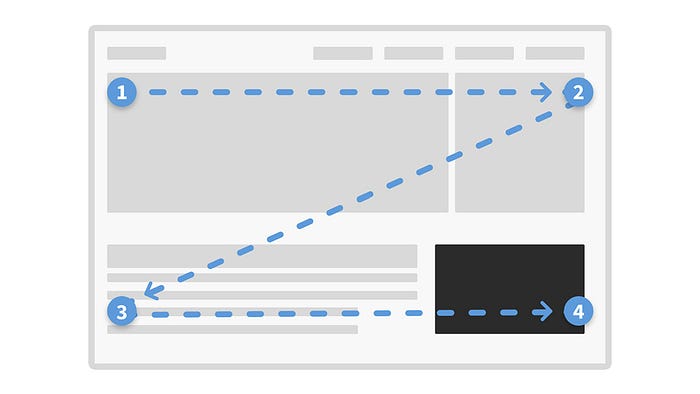
Z Pattern
In text-light designs, users typically scan in a ‘Z’ shape. This scanning pattern involves moving from the top left to the top right, then diagonally to the bottom left, and finally to the bottom right. It is particularly effective for layouts with minimal text, allowing users to quickly locate key information such as calls to action, navigation menus, and other essential elements. The Z Pattern leverages the natural reading behavior of users and is often used in designs that prioritize simplicity and clarity. By strategically placing important content along this path, designers can guide users through a seamless and efficient browsing experience.
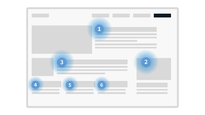
F Pattern
In contrast, text-heavy designs often see users scanning in an ‘F’ shape. This pattern starts at the top left, moves horizontally across the page, then down a bit and horizontally again. Eye-tracking studies have demonstrated that users concentrate on the top and left sides of the page, making this pattern ideal for content-heavy layouts. The F Pattern is commonly observed on web pages with extensive text, such as blogs and news articles. By placing crucial information along the horizontal lines of the ‘F,’ designers can ensure that users notice and engage with the most significant content. This scanning pattern helps in maintaining user engagement and enhancing content readability.
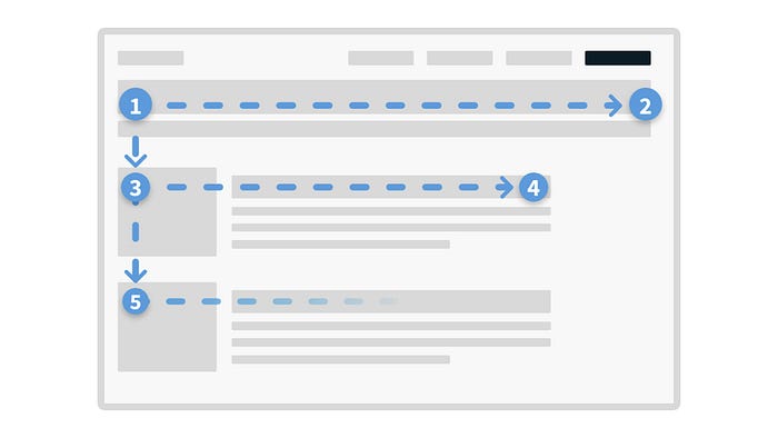
Layer Cake Pattern
The Layer Cake Pattern is characterized by users scanning horizontally across headings and subheadings, focusing on these ‘layers’ to find relevant information. This pattern is particularly useful for helping users navigate and understand well-organized content efficiently. By structuring content with clear and descriptive headings, designers can create a visual hierarchy that facilitates quick scanning and retrieval of information. The Layer Cake Pattern is effective in contexts where users need to sift through various sections of content, such as instructional guides, FAQs, and academic articles. By guiding users through a layered approach, this pattern enhances usability and ensures that critical information is easily accessible.
Additional Scanning Patterns and User Interaction Insights
Beyond the commonly recognized scanning patterns such as the F-pattern and Z-pattern, there are additional scanning patterns and insights into user interactions that can be leveraged to optimize website engagement.
One such pattern is the Serial Position Effect. This psychological phenomenon indicates that users tend to remember and prioritize information presented at the beginning and end of a section or page. By strategically placing crucial information at these positions, website designers can enhance recall and engagement. For instance, key messages, calls-to-action, or important links placed at the start or end of a webpage are more likely to capture user attention and drive desired actions.
Another insightful pattern is the Gutenberg Diagram. According to this model, users’ eyes naturally follow a reading path from the top-left to the bottom-right of a page. This implies that the top-left area, often referred to as the primary optical area, and the bottom-right area, known as the terminal area, are prime spots for placing key information or call-to-action elements. Utilizing this pattern can ensure that important content is positioned where users are most likely to notice and interact with it.
The Golden Triangle is another useful scanning pattern. This pattern suggests that users often focus on a triangle-shaped area that starts at the top left and extends down to the right. Understanding this pattern can guide the design of webpage layouts to ensure that significant information and interactive elements fall within this high-attention area, enhancing overall user engagement.
Additionally, insights into user interactions emphasize that users typically scan pages quickly to find relevant information. Engagement increases with organized, visually appealing, clear, and concise content. Easy navigation is crucial for enhancing user interaction and satisfaction, underscoring the importance of user-centered design in web development. By considering these additional scanning patterns and user interaction insights, web designers can create more engaging and effective websites that meet user needs and expectations.

